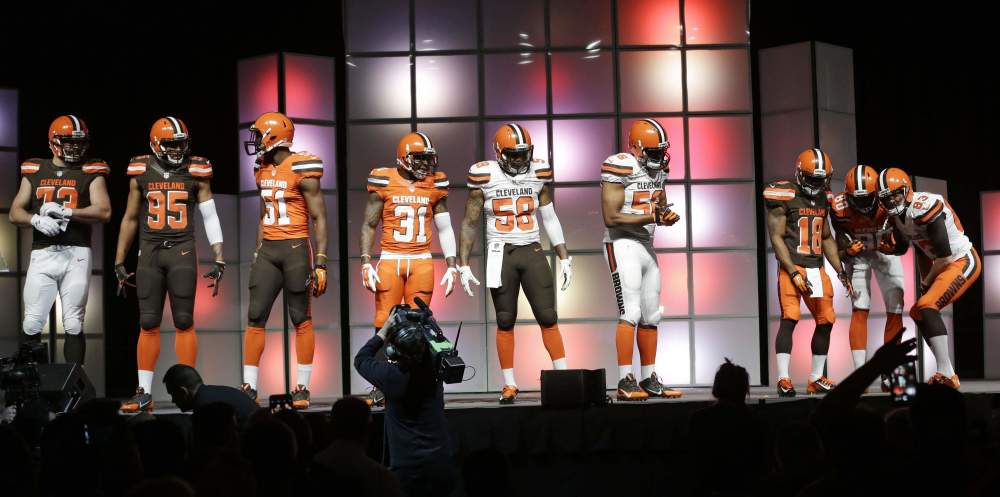
In the pantheon of Cleveland Browns miscues, it’s easy to admit that the team really didn’t whiff on creating its brand-new set of uniforms. To many people, they are “modern,” the first step to not just bringing the team back to not relevance, but full-on prominence.
Some might even say these new uniforms are cool.
But all of the marketing jargon in the world isn’t going to stop me from sorely missing the old look and hating these new jerseys with an eternally burning passion.
Because the team has been so bad for so long, people have asserted that the old uniforms were boring or hideous, as if that was the problem all along. The Browns’ jerseys as we knew them made for an all-time classic look, which meant that it was sharp without being flashy, which REALLY grinds Nike’s gears. Teams that don’t have EXCITING looks give Nike executives kidney stones, so the company decided it was time to finally defile the Browns’ look.
It has always been easy to identify the Cleveland Browns, for better or worse. Now, while the numerous uniform combinations are undoubtedly flashy, they seem to have poached the look of no less than 50 college football teams, with hints of the Arena Football League thrown in for good measure. They’re one step away from having the football uniforms from Starship Troopers.
It’s not that I can’t handle change. I like when teams modify their look. But the worst part of the new Browns uniforms is that they just look flat-out amateur. Having the city on the front looks stupid. Having the team name down the side of the pants looks stupid. Having the words “DAWG POUND” on the inside collar is REALLY stupid. Though the product on the field is always anything but professional, it was always comforting to know they had jerseys that linked them to a better past that could potentially one day be a great future. Had the Browns experienced any semblance of success in recent years, none of this would have ever taken place. That’s the most maddening thing of all.
But at least we know the Browns are elite when it comes to pulling marketing speak directly out of their asses. Taken from the team’s actual press release, these are the ways in which the Browns described their uniform changes:
- “CLEVELAND” emblazoned across the chest of all three jerseys, making the Browns the only NFL club to feature its city on the front of the jersey rather than its team name.
- “DAWG POUND” inscribed inside of the back collar of all three jerseys to pay tribute to the NFL’s best fans.
- Contrast stitching in the uniform construction that depicts attention to detail and craftsmanship to exemplify the City of Cleveland’s hard-working, blue-collar demeanor.
- Browns’ bold orange helmets also advance the new stripe pattern further with a distinct carbon fiber texture and a new brown face mask, representing the strong, industrious nature of Cleveland.
You can tell the organization really cares about the city not only through a brown face mask, but in the uniform’s stitching! Fans should be able to rest easy knowing that the team is still respecting its past by being as shoddily run as possible.

