Advertisers can be pretty sneaky when trying to get their messages across, as we’ve shown before. Let’s take a look at a few more ingenious examples of logos with more going on than it initially seems.
1) Tostitos
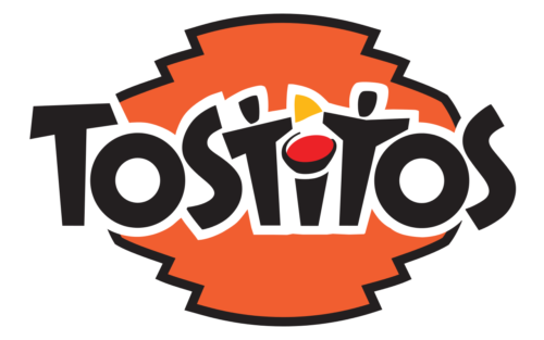 Eagle-eyed consumers will note that Tostitos has incorporated some clever branding into their logo. Check out the two customers sharing a chip over the salsa bowl above the “i.” What creativity!
2) NBC

NBC’s colorful logo was the brainchild of founder David Sarnoff, and if you’ll look closely you’ll notice the special flourish he gave it that survives to this day. That’s right; in the purple shape you can see a little indent of negative space. That’s Sarnoff’s nod to the niggling imperfections he knew he would never escape – the same imperfections that drove him onward as a businessman, and ultimately, into madness.
3) Popeyes
No doubt you’ve seen the logo for this popular chicken chain, but do you know the secret that lies within it? While commonly pronounced “Popeyes” like the famed cartoon sailor, the original and still preferred pronunciation is “Pope yes,” named in honor of Pope John XXIII in support of his controversial Vatican II council. The designs inside the red circle are also Catholic symbols, translating to “Blood Child.” Now you know!
4) Pittsburgh Zoo & PPG Aquarium

Here’s a fun one. Not only does the central tree in the image help to establish a firm link to nature, but if you look at the negative space around it you’ll see your parents arguing about custody during their divorce. Sure hope Mom wins!
5) Hooters
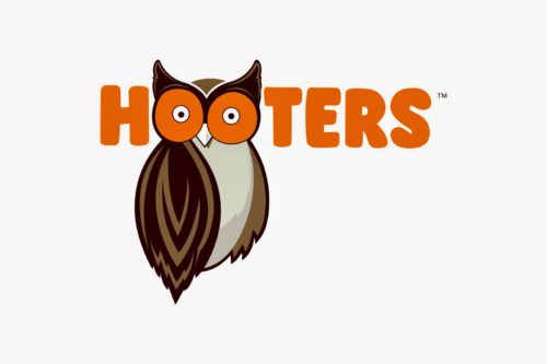
Every red-blooded American man knows this logo, but how many are aware of its clever composition? Take a look at the center o’s placed overtop the owl’s face. Notice anything? Yep, the ever-watching eyes of the famed Pinkerton Detective Agency, Hooters’ parent company. With all of the restaurant’s servers also being registered agency operatives, the owl helps remind patrons that the ladies see all, and know if you’re friend, or foe. Neat!
6) Taco Bell
Ready to have your mind blown? Check out the pink and yellow coloring inside this logo’s blue arch. If you squint just right you might be able to see a bell, which ties into the company’s name. That’s pretty nuts!
7) Miami Heat
Ok, this one might be a bit obvious but it’s worth putting on the list since it’s such a classic. Not only does the Heat’s logo reinforce their sport and fiery name choice, but the central ball has also been designed to resemble the single, veiny testicle all Heat players are required to have. Now that’s branding!
8) Hershey’s
Speaking of classics, we can’t leave this one off! While the brown coloring and rectangular shape of this logo both help to reinforce the image of everyone’s favorite chocolate bar, there’s a bit more happening here. Do a quick Google search and you’ll find that the company formed their name by selecting “her” and “she” to represent their expected consumer base. This decision of course came after the FDA and Congress once famously deemed the product “suitable only for womenfolk” and “not to be consumed by men.” In fact, it wasn’t until 1974 that a man even tried a Hershey’s Bar. Weird, right?
9) Kodak
This is a two-for-one. The name Kodak, of course, refers to “K’Od-ak,” the object said to be the key for opening Chancellor Zydrex’s Soul Atrium to free the Blood Spirits. The stylized “K” in the background, meanwhile, is actually the closest a human mind can come to comprehending the shape of K’Od-ak, as depicted in the Codex Q’eelti’xia. What exactly K’Od-ak is or how it’s meant to be used is an answer Kodak’s board of directors desperately seeks to this day!
10) Chrysler


